Case 2: Building Trust in Automated Grading
How student behavior led me to improve the grading algorithm, create a cross-platform testing process, and design more useful feedback.
My Role: Sole UX Researcher and UI Designer
Responsibilities: UX Research · Behavioral Analysis · Algorithm Tuning · Cross-Platform Testing · Interaction Design · UI Design
Outcome: More informative grading feedback · Improved grading reliability · Patented interface design
The Challenge
An incorrect answer wasn't always an incorrect understanding.
While analyzing high submission counts during my earlier research, I noticed an unexpected pattern. Some students whose sketches were marked incorrect would make only minor changes and submit essentially the same answer again.
When I examined these submissions more closely, I found that students were sometimes conceptually correct, but their sketches fell just outside the grading algorithm's acceptable tolerance. My earlier analysis documented students cleaning up and resubmitting essentially the same solution rather than changing their answer.
Other students had the opposite reaction. They would use Peek and lose stars even when their mistake was relatively small.
Both behaviors pointed to the same problem: students didn't always understand or trust the grading result.
Student 1: Distrust in the grader
After an incorrect submission, the student repeatedly cleaned up their lines rather than correcting the underlying mistake, suggesting they trusted their answer more than the grading result.
Student 2: Not knowing how close they were
The student was only one line away from a correct solution but didn't know how close they were. They used Peek and lost two stars for a relatively small mistake.
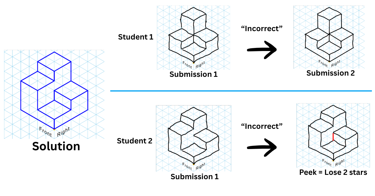
A binary “incorrect” result wasn't giving students enough information.
How could I make automated grading more reliable and give students enough information to move forward without giving away the solution?
I Couldn't Solve This With UI Alone
Better feedback wouldn't fix an unreliable result.
The first step was improving the grading algorithm itself.
I collected real student submissions that exposed problems with the grading algorithm and built a test set containing examples that should pass and should fail.
Changing one parameter could fix one problem while unintentionally affecting another, so I needed a reliable way to keep track of what was happening.
Creating a Repeatable Testing Process
I created a system to document each parameter change alongside the expected and actual results for my test submissions. After making an adjustment, I reran the test set and recorded which submissions passed and failed.
This gave me a repeatable way to tune the algorithm while checking that a change intended to solve one problem didn't introduce another.
Although the testing itself was manual, the process functioned as a lightweight regression test, allowing me to evaluate each iteration against previously identified cases.
One More Complication: Three Platforms
The same sketch didn't always produce the same result.
Spatial Vis was available on web, iOS, and Android, and I discovered that grading behavior could differ slightly between platforms.
That meant getting the desired result on one platform wasn't enough.
I manually tested grading changes across all three versions, tracked differences in pass/fail behavior, and continued adjusting and validating the parameters to achieve more consistent results across platforms.
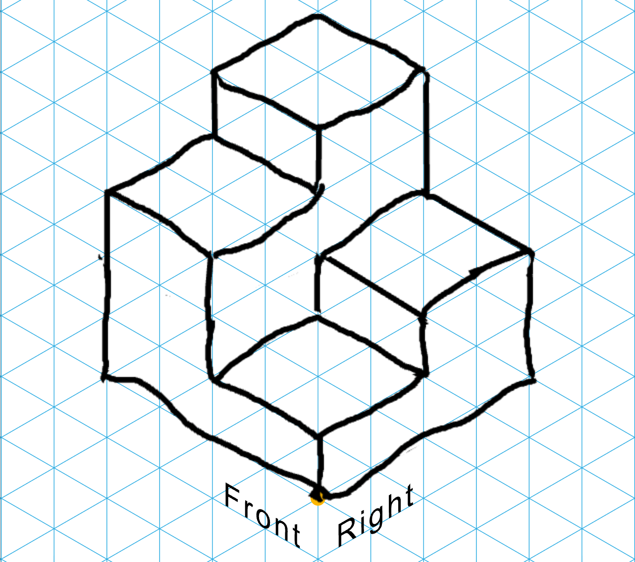
Should Pass
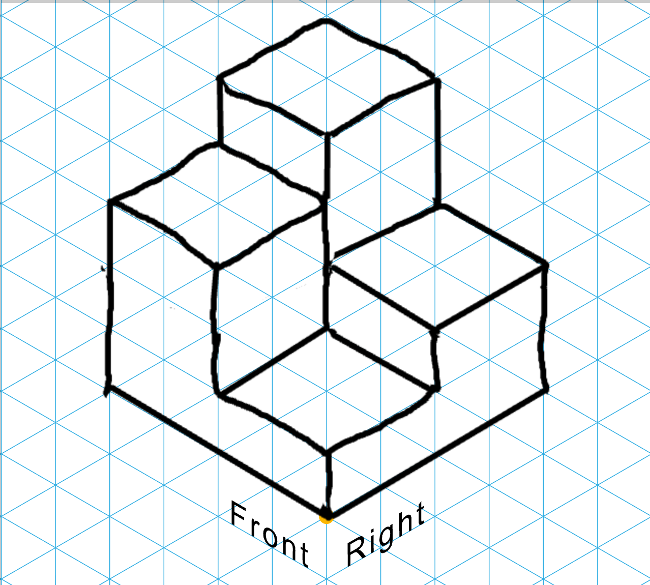
Should Fail
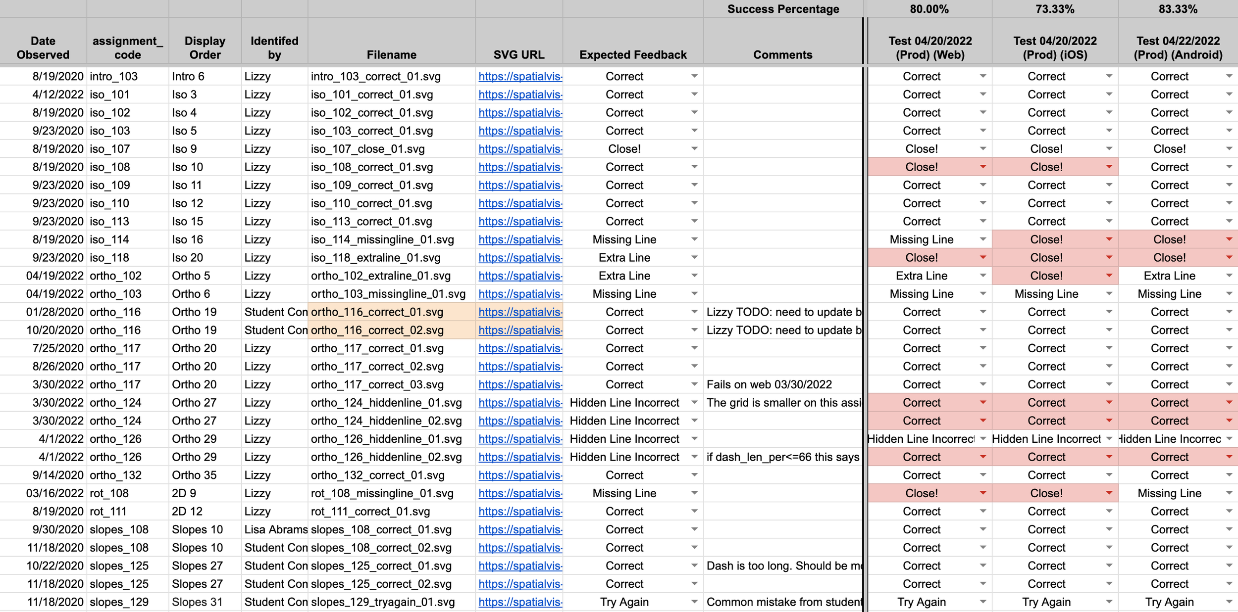
Algorithm Tracking Sheet
Accuracy Was Only Half the Problem
Once the grader was more reliable, there was still a UX problem.
Even a correctly rejected sketch could be very close to the solution. A simple incorrect result didn't tell students whether they had misunderstood the problem completely or were missing a single line.
That ambiguity could lead students to repeatedly resubmit their work or use Peek unnecessarily.
Students needed to understand their result well enough to make their next attempt productive.
Showing Students How Close They Were
Making the grader more transparent without revealing the answer
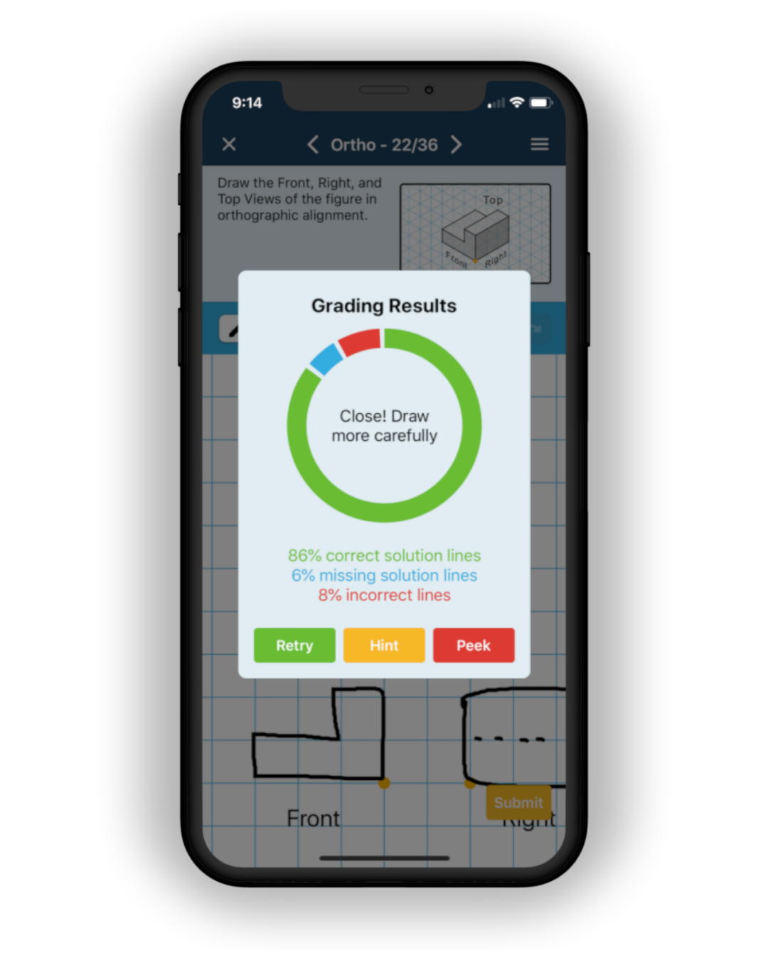
I designed an expanded grading-results interface that exposed more of the information the grading algorithm already knew about a student's submission.
Instead of only seeing that their sketch was incorrect, students could see the proportion of:
Correct lines
Incorrect lines
Missing lines
This gave students a sense of how close they were while deliberately avoiding identification of the specific lines they needed to change.
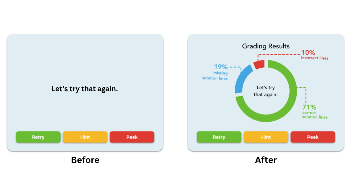
Giving Students a Nudge, Not the Answer
Feedback needed to be actionable too.
The grading visualization told students how close they were, but sometimes they needed a little more direction about what kind of problem to investigate.
We added contextual feedback based on common submission errors:
“Close! Clean up your lines.”
“You may be missing a line.”
“You may have an extra line.”
“Your hidden lines are incorrect.”
The messages intentionally avoided identifying the exact line that needed to change. Instead, they provided enough scaffolding to reduce frustration and help keep students within their zone of proximal development, while leaving the spatial reasoning to the student.
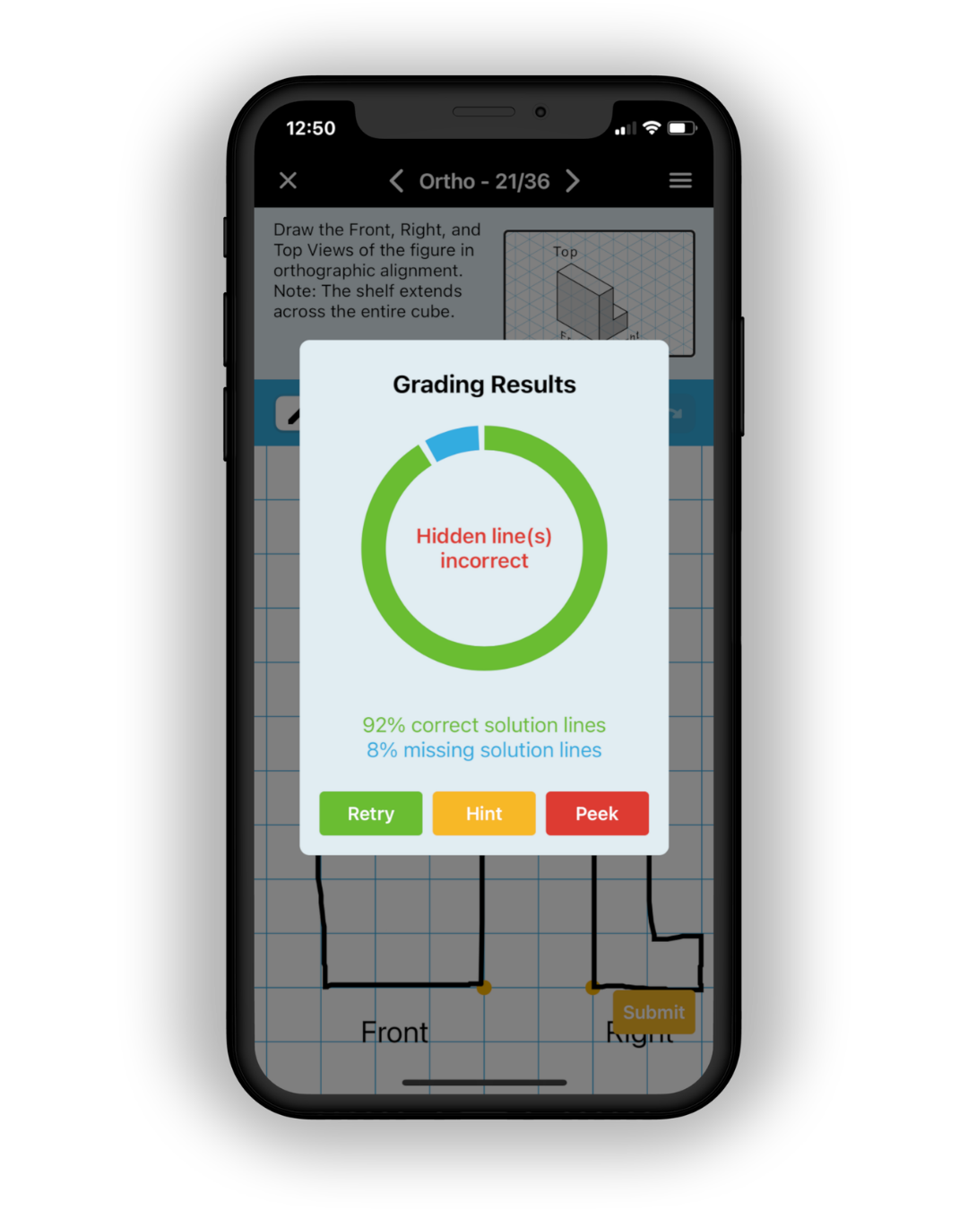
The Outcome
Improving both sides of the feedback loop
The final solution addressed trust from two directions.
Behind the interface, I created a repeatable testing process using real student submissions, tuned grading parameters, and validated changes across web, iOS, and Android.
In the interface, I gave students greater visibility into how their work was being evaluated and provided contextual guidance that helped them decide what to do next without revealing the solution.
The grading-results interface ultimately led to a U.S. design patent.
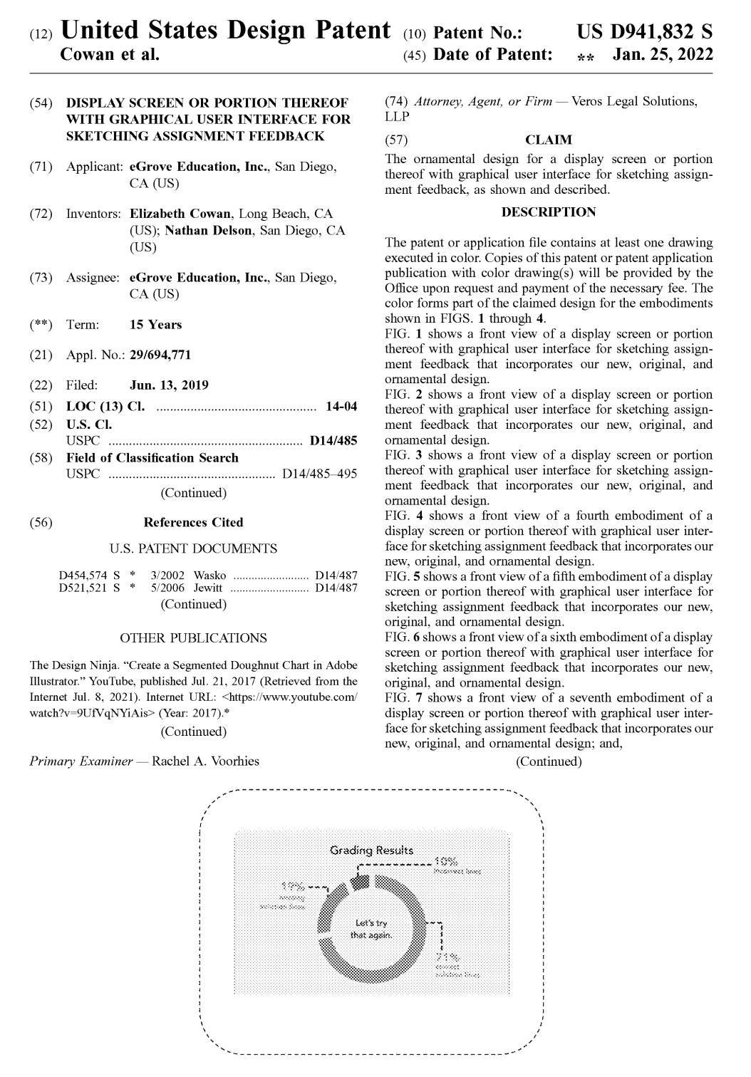
What I Learned
Trust starts with the system, not the interface.
This project taught me that a UX problem can't always be solved through interface design alone. Making an unreliable result easier to understand wouldn't have addressed the underlying source of frustration.
Solving the problem required me to work across the experience: understanding student behavior, improving and validating the grading system, and designing feedback that made its results more understandable.
It also reinforced a principle that continues to guide my approach to educational products: give learners enough information to move forward, but leave the important thinking to them.